As every e-Commerce website owner knows, getting visitors to your website is only half the battle- the real key is converting those users into customers. This blog post will focus on six small tweaks that you can make to your website that will enhance its ability to convert traffic into valuable sales.
1. Provide a strong USP on the Landing Page
This is especially important for converting new visitors who are unfamiliar with your brand. Your website needs to differentiate itself from competitors. Depending on how strong your perceived value is, you can convince users to purchase from your website instead of a competitor’s website.
An example of a unique selling point (USP) highlighted well on a landing page is shown with discountfootballkits.ie, in Figure 1 below:

Figure 1- Taken from www.discountfootballkits.com
Discountfootballkits.com stresses its two main selling points immediately upon entry to the website- the authenticity of the products (through promoting it’s Nike partnership) and the low price. This helps to differentiate this retailer from other competitors, while reassuring users that they are not about to buy substandard or unbranded merchandise.
For your own website, you need to ask yourself one key question:
Why should users buy from you instead of the competition?
Try to come up with one or two relevant and persuasive unique selling points (USP) that differentiate you from the competition. Potential USP’s could include next day delivery, strong after sales support, membership benefits or expert level knowledge of your staff.
2. Optimise your page loading speed
Slow loading pages are a complete conversion killer.
You could have a great product, excellent content and an exceptional USP, but if your pages take longer than 2-3 seconds to load, you will lose users.
According to a study from Kissmetrics:
- 47% of consumers expect a web page to load in 2 seconds or less.
- 40% of people abandon a website that takes more than 3 seconds to load.
Imagine losing 40% of your traffic before the page even loads!
You can check your own website’s speed with the Google PageSpeed Insights tools https://developers.google.com/speed/pagespeed/insights
It grades the website (out of 100) and highlights issues that should be fixed on mobile and desktop that would improve the website loading speed. You can use it to assess a landing page or any particular pages that users will pass through on their journey through the website.
3. Make Add to Cart button stand out on Product Pages
This is an essential tweak for any product page. The ‘Add to Cart’ or ‘Buy Now’ button should be the most dominant button on the product page.
You should make sure that the Add to Cart button stands out by ensuring it is at least 120 pixels pixels wide x 30 pixel high.
One method for making the ‘Add-To-Cart button stand out is to ensure that the colour of the button contrasts with the background colour.
This uses a psychological principle known as the Isolation Effect. This states that an item that stands out is more likely to be remembered and utilised. Research from Aesthetic Response to Color Combinations found that participants were more likely to follow through on a button (be it text or an image) when it blatantly sticks out from its surroundings.
Using this basic colour wheel should help identify which colours will compliment your specific background. Try to use the colour situated opposite your chosen colour on the wheel e.g. a green button on a red background to ensure contrast:

Figure 2- Colour Wheel with complimentary colours
For extra style points, you can include the colours of your brand across the entire site, including on your Add-to-Cart Button. This gives your branding a strong boost, while still offering the contrast the Add-to-Cart button requires. Online Marketplace Amazon.com uses this theory quite well for their ‘Add to cart’ button, which uses the orange from its logo, framed by the complimentary shade of blue, as seen below in Figure 3:
***N.B. You should ensure that buttons are labelled correctly: Add to Cart should direct to the Shopping Cart, while Buy Now button should take them straight to the Checkout page.**
4. Relevant content on the left, CTA should be on the right.
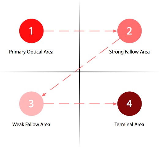
English language users read left to right, so any content that is vital to the user’s understanding of the product or service should be on the left of the page. This ensures that it is picked up as a user skims through the content. Conversely the Call-to-Action (CTA) button (which will direct the user to the next stage of their website journey ) should be below and to the right, as highlighted by Figure 4, also known as the Gutenberg diagram. This diagram highlights how the general eye pattern of a web user moves around when skimming through content.
The heat map of a Google Search engine result page in figure 5 shows that user instinctively go to the upper left of the page when searching for information, which is where Google displays the highest ranked links.
5. One clear Call-To-Action (CTA) per page
When a user lands on a page, they should have one clear route to take to achieve the sale or subscription. Having too many CTA’s can give the user too many options and cause them to either exit the website or get lost navigating around your website.
Two good examples of clear CTA’s are from two major online market leaders: Netflix & Skype. The Netflix and Skype landing pages are great examples of where one prominent CTA exists and therefore there is one clear path to take. This reduces the chance of users exiting the website before they have completed the desired action i.e. the conversion:

Figure 6- Taken from www.netflix.com

Figure 7- Taken from www.skype.com
6. Avoid inconsistent design on the website
If a user lands on a page with blatant design inconsistencies, it can give the impression of a poorly maintained website. This can cause users to question the believability of the content and suitability of the entire brand. This is especially relevant for brands positioning themselves as industry experts or premium products, but can also apply to any e-Commerce website.
Your website needs to have a consistent look and feel across all pages from homepage to checkout page and across all platforms: desktop, tablet and mobile. This can be done by implementing a strict colour scheme & format across all pages, including font size, font type and style. This can be aided by using one CSS file for the entire website thus ensuring that the styling of text and content is consistent.
To ensure a consistent experience across all devices, it is best practise to use a responsive design, as opposed to dynamic switching or different urls for mobile (For more information on these different approaches to mobile, check out http://searchengineland.com/the-definitive-guide-to-mobile-technical-seo-166066).
A great example of this consistency across platforms has been implemented by most big brand news websites, which has increasingly seen its customer base shift from reading newspapers to reading news online. The below example shows the consistent feel and design that Boston Globe employs across all devices that its users may use:

Figure 8- Taken from The Boston Globe
If you have any questions about how to implement these strategies on your own website, please don’t hesitate to comment below or drop us an email at info@searchscientist.co.uk.


No comments yet.